Setting up your classroom can be daunting and fun. The thrill of decorating and creating a stimulating learning space is all new teachers can think about (and a lot of not-so-new teachers as well!) but how do you make sure it is not OVER stimulating?
I've been in some classrooms that have been Pinterested-to-death. Every idea, every thought the teacher has seen has been stuffed into that classroom. I even saw a classroom with flashing fairy lights around the board! Classroom decor should enhance the classroom, keep it feeling homely but should not over stimulate the students. This will allow students the space to think... and we want them to think, not be told what to think all the time.
My personal rule for classroom decor is:
- keep it simple
- keep it purposeful
- keep 50% or more of the wall space for student work
Here is a snapshot of my classroom and the resources I use (shown below).
Student Name Plates (a MUST for the first day)
KEEP IT SIMPLE
Keep fonts bold, big and easy to read. That running writing font across the top of the whiteboard might look pretty in a show home but in a classroom it can be a huge distraction as students try to figure out what it actually says! I do love a bit of cursive though, but use sparingly in early grade classrooms. Overwhelming fonts and colours can also be a big distraction. Pick a colour scheme and try to stick to two or three colours. This will bring your classroom together in a calming way but keep things fun!
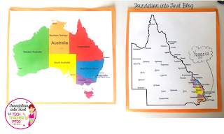
Watch your hanging space. Some students, especially those with attention or sensory issues, can find flapping paper very distracting, even upsetting. I've found using my hanging space only for seasonal celebrations, as the wonderful mrsc_in_year3 has done for Australia Day (below), is a good way to display student work. Once the season is over, pull it down and give students a break from hanging material. When you DO put some more up, it will be far more engaging and exciting for students if it isn't done too regularly.
KEEP IT PURPOSEFUL
That alphabet chart across the top of the whiteboard...see how pretty it is? Why is it there? Unless you're referring to it throughout the day, then it's just another distraction. Don't get me wrong, I LOVE some pretty alphabet posters, but use them wisely. We're aiming for minimal distraction.
Word walls are a great idea, but do not put every word on them at the start of the year, otherwise they are pointless. As you come to one of those words, then purposefully place that word on the word wall, this way students will make a connection to the context of that word, and be able to refer back to the wall for spelling and contextual clues.
Rules. They are one absolute MUST of any classroom, but where do you place them? I've personally found that they are of most use at locations of, shall we say, conflict. So the 'no running' poster sits near the door, so they can read it on the way out to break as a rule reminder. The 'whole body listening' poster work will near the whiteboard as a rule reminder. Be strategic. For more on setting up classroom rules click here.
KEEP 50% OR MORE OF THE WALL SPACE FOR STUDENT WORK
At the start of every year I see teachers falling into the trap of covering their walls with beautiful artwork they have made themselves. To students, this tells them that a) their work couldn't possibly compare to the perfection of your work and b) it's not their classroom - it's your classroom.
Students need to feel ownership of their space at the start of the year and refresh that work on the walls throughout the year. The space is theirs, not yours. When students have ownership of classroom space they are more compelled (I've found from my own experience) to take better care of it. Classroom Jobs also help students to feel a sense of ownership.
What do you think? Does your school have a 'less-is-more' approach to decorating your classroom? I'd love to know in the comments.


